Hi all, we like to share three insights that help to create better page layouts, in order to create more user friendly apps. Any thoughts? Pls share in the comments.
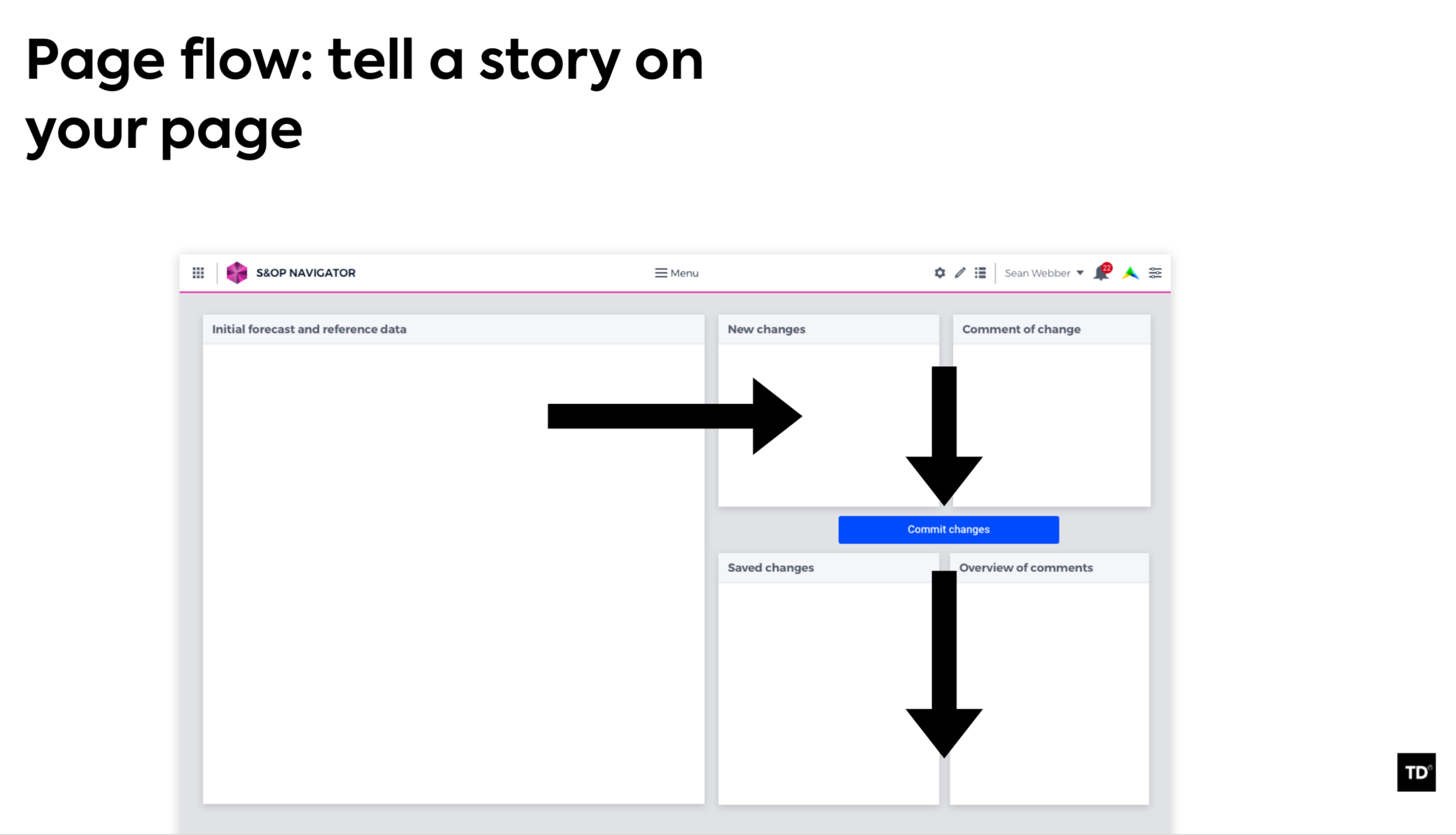
Tip 1: Tell a story on your page, by matching the placement of widgets to your user's ideal flow. Next, order your widgets from top left to bottom right. Bottom right is also a great place to put a button to go to the next step in the flow.
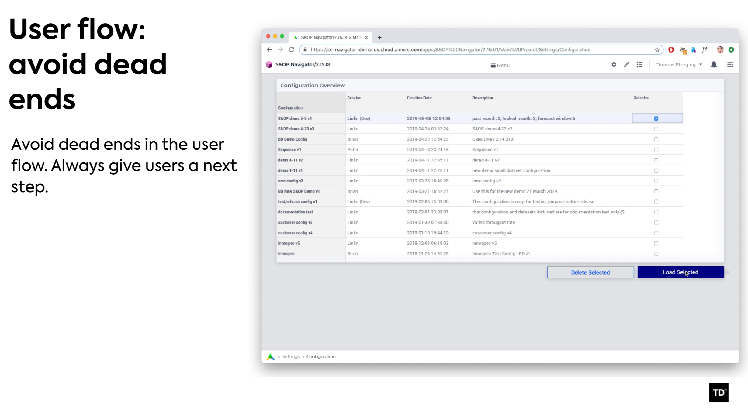
Tip 2: Avoid dead ends in your app. This will confuse the user as he may not know what to do next. Making a button appear to go to the next step is a great way to keep the user flow going.
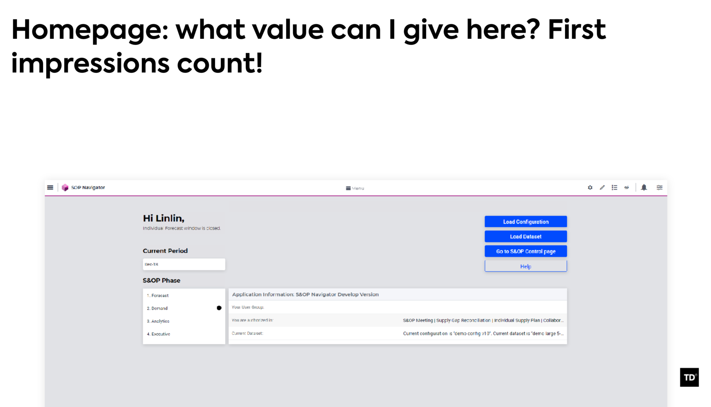
Tip 3: Make an attractive home page, since we all know that first impressions count! Consider what widgets to place here that give some immediate value to the user. Maybe the results form last time, maybe a map, maybe the progress of the app, or what is expected from the user.
Sign up
Already have an account? Login
Please use your business or academic e-mail address to register
Login to the community
No account yet? Create an account
Enter your E-mail address. We'll send you an e-mail with instructions to reset your password.
