How to Display an On/Off Switch in Widgets

  • 28 March 2019
  • 4 replies
  • 198 views

Userlevel 2
Identifiers with
code:
binary
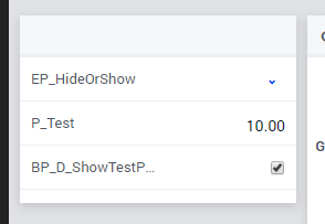
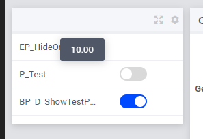
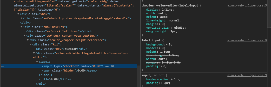
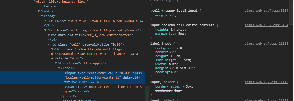
range are displayed as checkboxes in table and scalar widgets of AIMMS WebUI, by default. You can render on/off switches instead of checkboxes using CSS.

Here

4 replies

Userlevel 2

To apply the suggested CSS in the current WebUI version (4.71.2.2) it was necessary to make an adjustment in the class .boolean-value-editor (In this version I couldn´t find this class) .

I changed the class .boolean-value-editor to .cell-wrapper and worked well. 

Below is a part of the code:

/* Add the Slider area (outer rounded rectangle)*/

.tag-scalar[data-widget\.uri*="Switch"] .cell-wrapper input+span {
float: right;
left: -41.3%;
text-align: left;
margin: 9px 0 0;
cursor: pointer;
text-indent: -9999px;
width: 40px;
height: 20px;
background: grey;
display: block;
border-radius: 20px;
position: relative;
font-size: 0;
}


The .cell-wrapper class is the correct class to use in this case? 


Userlevel 4
Badge +4

Given the fact that you changed it and that it worked for you, would allow me to say that it is correct. In your case.

Using the very generic (and yes, often present) cell-wrapper class as a selector for styling inputs, might influence other types of inputs as well. But in your case you added the 'filter’ that limits it to the context of a specifically named scalar widget. So you’re safe.

Without knowing why our documentation seems to steer you in the wrong direction and why scalars are different from tables (I’ll raise an issue for that here, internally), I can only offer the suggestion that the actual indication of whether a value is editable as a boolean or not, is apparently right on the inputs themselves.

So I’d be changing the example css in the documentation to something that does not incorporate the boolean-value-editor class and which replaces all reference to input with something like:

input[type=checkbox][class*=boolean]

And that would work for both scalar and table, also doing away with the need to have separate definitions for both, if you want switches everywhere anyway.

But I’m probably overlooking some details here, so I have to get back to that.


Thanks for bringing this up!

Userlevel 5
Badge +5

@splugues , like Edo mentions - cell-wrapper is a very generic class. You are also using the widget limiter ([data-widget...]), which is likely why are are not seeing this but .cell-wrapper is going to make all your scalar widget fields as on/off buttons. See below screenshots, pTest should obviously not be a on/off switch as it has a value of 10. 

Without any styling
With .cell-wrapper

In the release notes of 4.70.1, it is noted that CSS classes of the scalar widget have been updated and .boolean-value-editor is now .boolean-cell-editor-contents. However, making this change doesn’t seem to be working as the CSS applied to the widgets is different now compared to older versions. 

Until 4.69
4.70 and above

Custom CSS styling is not part of our test suite, so we missed that the code in our docs is not working anymore. Thanks for the note. 

Userlevel 2

Thanks for all support @Edo Nijmeijer and @mohansx

Reply


Didn't find what you were looking for? Try searching on our documentation pages:

AIMMS Developer & PRO | AIMMS How-To | AIMMS SC Navigator