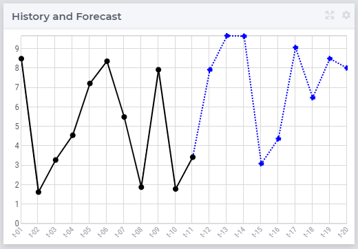
I have a parameter over weeks with historic and forecast info. I want the historical week to be a dotted line and from the current week onwards a solid line. I use an annotation ‘dash’ and created a string parameter that have dash for the historic weeks. I added this as annotation the parameter, but if I use this all the weeks are dotted. (When I remove the annotation the whole is solid, as it should be).
So is it possible to change the line over the axis?
Best answer by Anonymous
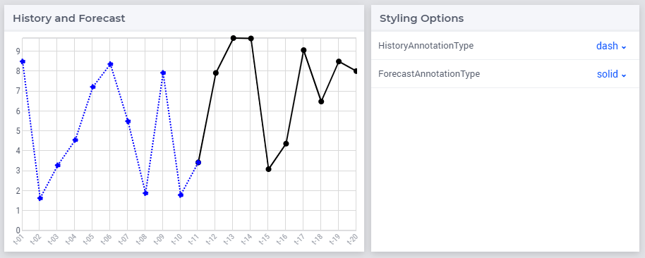
@Marc Wingender , you can do this by creating two different identifiers, giving them each their own annotation.
See e.g. below the result and attached project where I have a HistoryValue() and ForecastValue() line. They both run over the superset of all time periods, and each have their subset of history vs forecast periods. To connect the two lines, I made the first ForecastValue the same as the last HistoryValue (t-11).
Line chart with 2 identifiers represented differentially using annotations
The annotation determines color, style of line and circle:
.annotation-solid {
	stroke: black !important;
	}
.annotation-dash {
	stroke: blue !important;
	stroke-dasharray: 2;
	}
circle.annotation-solid {
	fill: black !important;
	}
circle.annotation-dash {
	fill: blue !important;
	}
PS: @Marc Wingender, realize now the ask was the other way around: Historic data dashed. Just switch the values of the HistoricAnnotation and ForecastAnnotation in the model, refresh page, and you are good to go.
Hope this helps.
4 replies
A
Anonymous
Answer
September 29, 2020
@Marc Wingender , you can do this by creating two different identifiers, giving them each their own annotation.
See e.g. below the result and attached project where I have a HistoryValue() and ForecastValue() line. They both run over the superset of all time periods, and each have their subset of history vs forecast periods. To connect the two lines, I made the first ForecastValue the same as the last HistoryValue (t-11).
Line chart with 2 identifiers represented differentially using annotations
The annotation determines color, style of line and circle:
.annotation-solid {
	stroke: black !important;
	}
.annotation-dash {
	stroke: blue !important;
	stroke-dasharray: 2;
	}
circle.annotation-solid {
	fill: black !important;
	}
circle.annotation-dash {
	fill: blue !important;
	}
PS: @Marc Wingender, realize now the ask was the other way around: Historic data dashed. Just switch the values of the HistoricAnnotation and ForecastAnnotation in the model, refresh page, and you are good to go.
Hope this helps.
A
Anonymous
September 30, 2020
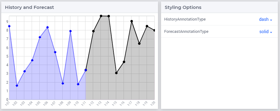
Here an extended version where you decide how to display the identifiers via a selection table: solid or dashed (and now switched to the order you initially asked for 😉).
Extended example with ability to change display via dynamic annotation settings
I wanted to also show that the area below could use similar coloring, but we noticed a small issue in AIMMS and we need to fix that. Idea would be to add the following to the annotation.css file:
Thank you for answering, although splitting the identifier was already on my workaround list. I was hoping to avoid this, since there were a lot of parameters now that need to be split.
Kind regards,
Marc
A
Anonymous
October 1, 2020
Hi @Marc Wingender,
Unfortunately that is indeed the case; lines are in that sense somewhat special. Where you can individually color bars, circles, wedges etc. as they directly relate to a value such as demand(t-1), lines are connection between such points and don’t belong in that sense to a specific value. Hence the line is a separate ‘object’ and drawn/styled as such.
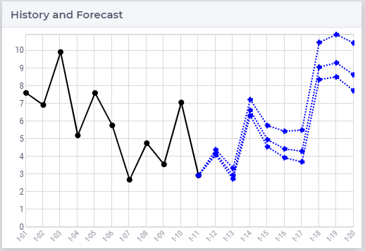
BTW: By splitting this, you can think as well of adding a set of forecasts (e.g. low, normal, high)
Sign up
Already have an account? Login Please use your business or academic e-mail address to register