I would like to visualize the opening and end stock in one line. This means for example
Opening Stock Week 1: 100 (t = 1)
End Stock Week 1: 80 (t = 2)
Opening Stock Week 2: 120. (t = 2)
This means on the x-axis (t = 2) has 2 values 80 and 120. I would like to see this jump without creating dummy x-axis points which are very close to t = 2.
Is this possible?
Page 1 / 1
Not sure if it would work for you, but if you create a parameter that is two dimensional:
pStockLevel( iPeriod, iOpeningOrClose )
where the second index is just an index for set with opening and close elements, you could put period and openingclose on the x-axis. However, they will be evenly spaced, not sure if that is what you want
Thanks Guido for your suggestion.
It is not the full solution yet, but this option visualizes the best so far
Hi @Marc Wingender ,
Can you share a visual/screen-capture of the result? As we do not have such a stock chart in stock, so curious to see how the suggestion of @gdiepen plays out for you. Can imagine others love to see it as well.
Thanks in advance.
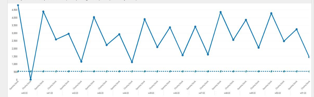
This is an visualisaition of the stock graph now…
The dotted straight line is the safety stock
@Marc Wingender
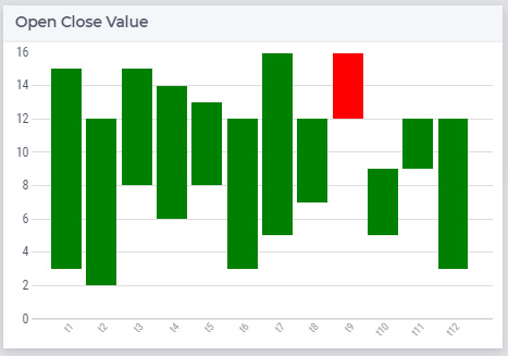
Maybe you can also use the Bar Chart to display the difference per period. If it’s not (like in example) always 1-directional (going down), you could use color coding for each direction.
This is a stacked bar-chart where I made the base transparent (‘Closing Stock’ value in your example) and calculated the difference between ‘Opening’ and ‘Closing’.
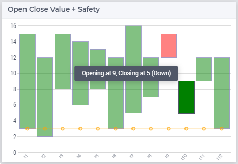
Soon we’ll add the line option allowing you to add e.g. a safety stock line.
High Low chart using the Bar ChartHigh Low chart using the upcoming Bar-Line Chart
Thanks Gertjan, for your suggestion. For now we wait for 4.76 and then decide if we want to move forwards using the combination of the bar and line chart.
Reply
Sign up
Already have an account? Login Please use your business or academic e-mail address to register