Possible to style buttons?


Userlevel 5
Badge +7

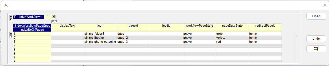
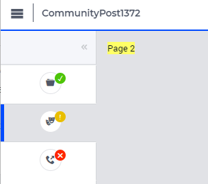
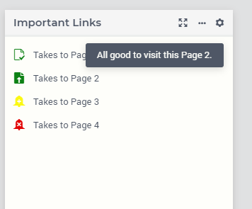
Just wanted to know if it is possible to style the buttons in AIMMS based on information from the model.


What I have in mind is allowing the user to open for example 25 different pages (e.g. for different inputs) by providing 25 different buttons.

I would like to style these buttons in such a way that if the input that corresponds to the page this button opens contains an error, the button should be red or I would like to include a red Error symbol (think might be possible with unicode and variant selection?) on that button and if there are warnings, I would like to make it yellow or have a yellow warning symbol. Green checkmark could indicate there are no issues with that particular input.


It could also be that buttons to open the 25 different inputs are not the best way to this from UX perspective. If that is the case, what would you recommend?


10 replies

Userlevel 6
Badge +6

Hi Guido,


Are you familiar with the workflows? These are fully controllable through the model and also have status and color options. You can even decide to not ‘open’ certain parts of the article workflow if certain data contains errors  (or another condition is not met). 

Many customers love this features for your type of tasks. 

See: 

https://documentation.aimms.com/webui/workflow-panels.html


Userlevel 5
Badge +7

Hi Gertjan,


I do know about this, but not sure if that would work here (or maybe I just don’t know enough about the workflows yet).

As mentioned, the number of input sheets I want to deal with is around 25. For each of these sheets, there can be either warnings (meaning I can continue the flow, but user should give it a quick look) and errors (workflow cannot continue). And of course, green would indicate no issues on this input sheet.


In the example from the link you gave, I could do something like Validate/refine input sheets as a workflow item that would not allow to continue to the next stage as long as there are hard errors in the input. 

However, it is then not clear what the best way is to provide the user with the info about the 25 input sheets (which ones are OK (green), warning , stopping error)

How would you handle this with workflows?

One possibility I can think of would be if I could create buttons to open pages inside a table. In the post https://community.aimms.com/aimms-webui-44/how-to-change-specific-table-identifier-checkbox-to-a-image-button-555 I saw something about creating links/icons, but not sure if you can use these links to trigger opening a new page in the aimms webui.

Userlevel 6
Badge +6

I have seen people do this as well @gdiepen, once you go to custom css, many things are possible. 
 

Based on your suggestion of a table, I can see a table of 25 rows what a number of properties such as description, status, etc. You can then click on each cell for a Widget Item action (eg open another page). This feels to me less intrusive and more user friendly than 25 buttons scattered over a page with potentially weird scaling issues. Also, extending, or reducing is simple; and your user can easily opt/filter to also eg show those that have errors with a column filter keeping your end user focused, or those input sheets that are about production (filtering description); even preset selections (subsets) can be build and selected via Table Actions menu, or you can use the new Search and Find options of the table.

The table is super rich in functionality. So looking back at your request, I think using it is a better way since you have so many input sheets. 

Some info on this topics:

https://documentation.aimms.com/webui/widget-options.html#item-actions

https://documentation.aimms.com/webui/table-widget.html#search-and-find

https://documentation.aimms.com/webui/table-widget.html#search-and-find


Userlevel 4
Badge +4

Hello Guido, let me just emphasize and highlight what Gertjan has already achieved to explain pretty well.

Most importantly, I have to concur with Gertjan about taking care to not overload your users with an unwieldly interface. When having that many ‘pieces of information’ on screen, you really need to choose how to display those carefully.

25+ buttons probably falls into the ‘unwieldly’ category, for anyone. That same amount indeed also makes it very hard to manage/control it through the ‘standard’ ways of solving this, which is through Workflow and its states.

Regular Button widgets do not really have options to style them dynamically. Yes, you can of course control contents (and be creative with ‘icon font’), but you cannot control things like background colors through the model: you cannot apply annotations to it, like you can with the data of a table or chart.

Therefor, the suggestion to use a table cells or maybe a bar or line chart + custom css + item actions, to create a miniature dashboard that shows you all those 25+ states in one pretty compact overview, is I think indeed the most promising. Not easy, but all options are there.

If you could group your statuses into a number closer to maybe 10 groups, perhaps you could also get creative with Side panels. They too have tab labels, icons and colors that can be specified dynamically. You could re-use the Side panel on different pages and use the grouped sidepanel tab contents to navigate back and forth to specific pages. At least all those links/buttons could then be ‘out of view’ when desired, with the tab showing state.
Regular Side panel tabs are fixed to about 7 I think, but a simple line of css could alter the vertical size of Tab so you have slightly more space.
If you want to keeps things horizontal, maybe the Status Bar can do a similar trick for you.

Sounds like an exceptional case to me, whatever way we turn it. I hope you find some ideas among the above. And if you are looking at specific styling challenges, find me here too.

Best regards,

Edo

Userlevel 5
Badge +7

Thanks gertjan and edo!


I was aware of the fact that adding 25 buttons would not be the best way forward, but did not really see any other option (except for the link I shared to the other forum topic)


Grouping these items together might not be the easiest, best would still be I think to use a table to display this information.

Will have to do some more testing/digging to see what will be the best way forward for this.

Is it possible to create a link to another page in a table without using widget actions? So if in the table I display all the sheets as rows with the status as an icon in one of the columns. Is it possible in the webui at the moment that if the user clicks on this icon the corresponding page showing the data for this input sheet is opened? Or is this only possible using the widget actions (which require right-mouse click)?

Userlevel 4
Badge +4

Is it possible in the webui at the moment that if the user clicks on this icon the corresponding page showing the data for this input sheet is opened? Or is this only possible using the widget actions (which require right-mouse click)?

Normal behavior for a table cell is, of course, to get the focus, upon left-clicking. Or depending on the content/state: jump to edit-mode.

Maybe you could slightly abuse the Store Focus functionality to act upon a certain focus happening, and jump pages when it happens. Although you’ll probably surprise your user a bit.

Having your user go through a right-click to select an item-action is perhaps one click too many from the perspective of what you’re trying to achieve, but it does follow standards. Maybe you can even think of other actions that are relevant for a certain ‘state’ of your 25+ steps. Like ‘Resolve Manually (jump)’, ‘Resolve automatically’, and ‘Ignore’.

But bottom line is: it will not be a direct left-click jump without effort (using normal solution options).

I’m not envious of the amount of state-management that you’ll be needing to do for all of this (and are  probably already doing in some shape or form, now) ;-)

Userlevel 3
Badge +5

Hi @gdiepen,


How about making advantage of the List Widget


I think you could list all of your 25+ entries as list items. Each item can be controlled using a display text, tooltip, icon, icon-color and active\inactive\hidden state.

You can modify this list's content dynamically, including the list item text, tooltip, etc., through modelling.

A crude sketch that I could come up with


The documentation for it can be found here https://documentation.aimms.com/webui/list-widget.html#list-widget


Do let me know if this was of any help.


Thanks,

Madhu K

Userlevel 5
Badge +7

That might also be an option! Thanks @Madhu Krishnappa !

Userlevel 5
Badge +6

Hey all, from the workflow documentation you may not be able to notice this possibility, so I created a small code and example to show one more idea. By using the pageDataState with any word, you can create an specific css to that state class. 


CSS code:

.workflow-panel .step-item.active.yellow .icon:after {

    content: "\01C3";

    position: absolute;

    width: 1rem;

    height: 1rem;

    border-radius: 50%;

    font-size: .625rem;

    font-weight: 700;

    line-height: .9375rem;

    text-align: center;

    background: rgb(233, 190, 0);

    color: #fff;

}


.workflow-panel .step-item.active.green .icon:after {

    content: "✓";

    position: absolute;

    width: 1rem;

    height: 1rem;

    border-radius: 50%;

    font-size: .625rem;

    font-weight: 700;

    line-height: .9375rem;

    text-align: center;

    background: rgb(77, 196, 9);

    color: #fff;

}


.workflow-panel .step-item.active.red .icon:after {

    content: "\2716";

    position: absolute;

    width: 1rem;

    height: 1rem;

    border-radius: 50%;

    font-size: .625rem;

    font-weight: 700;

    line-height: .9375rem;

    text-align: center;

    background: rgb(255, 38, 0);

    color: #fff;

}

Result:


With that you can modify those states direct into a procedure, you can have a “Run All Consistencies” as a Page Action added to all pages, you can also have a list of errors per page that has errors. 

Or even a summary page with all pages x warning/error. 


Userlevel 5
Badge +7

Also good to know!

Turns out, there are quite some different options :-)

Think I need to really learn more about the css stuff though...

Reply


Didn't find what you were looking for? Try searching on our documentation pages:

AIMMS Developer & PRO | AIMMS How-To | AIMMS SC Navigator