Requesting a guaranteed/default number of ticks on the x-axis
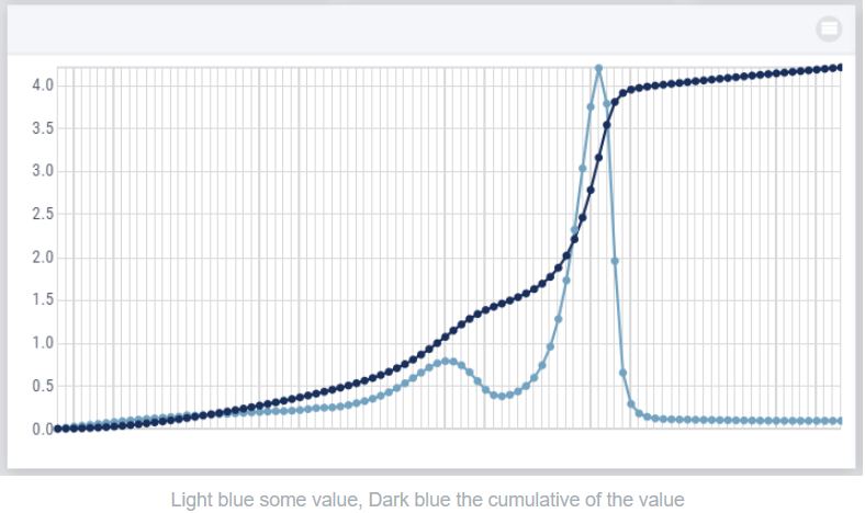
In the graph below there are apparently too many values in the graph to show the corresponding xticks properly, so AIMMS hides them.
Instead, I would expect that the scaling is adjusted and I would see fewer x ticks, but at least the minimum and maximum and some ticks in between.
So can the default x ticks be such that something reasonable is shown instead of no ticks at all?
Page 1 / 1
Hi @Brn
Thanks for sharing!
Updated idea status Discussion ongoing → ON ROADMAP
The following idea has been merged into this idea: All the votes have been transferred into this idea.
Hi @Brn
With the 4.85 release, the new Combination Chart Type built over HighCharts library smartly arranges the X-Axis ticks. In the widget’s option editor you can also define the X-Axis intervals/StepSize to be considered.
Curious to know if you got a chance to try out this X-Axis StepSize and other exciting features of the new Combination Chart Widget type.
Please leave your feedback and suggestions on this new Combination Chart Widget type in this group.
Thanks,
WebUI Team.
Updated idea statusOn Backlog→Implemented
Thanks for the update, @Madhu Krishnappa !
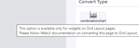
Unfortunately, I did not succeed converting my chart to a combination chart. I tried, but I do not see any result (I am using the new grid pages):
@Brn I suspect you have not enabled the “Combination Chart Widget” experimental feature yet.
Could you please enable this experimental feature and try it out.
Please do let me know if you are still not able to locate Combination Chart widget on the page.
Thanks,
Madhu Krishnappa
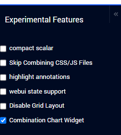
Where can I find these checkboxes?
Hi @Brn
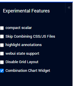
To access and enable/disable the list of experimental features you can follow the below steps:
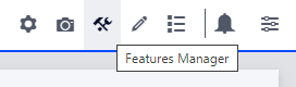
You need to press a three-key combination i.e CTRL+SHIFT+. (Control Key + Shift Key + Dot/Fullstop Key) on the WebUI.
Once you key in the combination you will see a new icon in the Application Toolbar in the top right corner. Click on the icon.
Clicking on the icon will reveal the Experimental Features menu on the left hand side.
To enable the feature, just check the checkbox for “Combination Chart Widget” feature. After enabling the feature either click the Reload text or refresh the page. The feature will only be active once the page is reloaded.
More details about Experimental Features can be found here.
Thanks,
Madhu Krishnappa
Hi @Madhu Krishnappa ,
Sorry for the late response. I tried to add the Combination Chart in a 4.87 model and first I got this feedback:
So I created a new page with a Grid Layout and a widget with a combination chart, where it took me some time to find out that I had to drag new widget to an area, cause I was not yet familiar with Grid Layout pages.
Then I configured the content in the combination chart and the step size on the x-axis. I saw that the (default?) labels on the x-axis are the name of my parameter, then I moved the identifier to Totals in the Pivot configuration and the labels disappeared.
My questions:
Is it also possible to add these charts for normal pages in the WebUI?
How do I visualize my x-axis labels?
Sign up
Already have an account? Login Please use your business or academic e-mail address to register