

After I added a new widget (e.g. table widget) to any webui page and then add new identifiers to the table, the dialog used for this is relatively small in size:
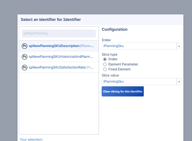
Since I normally try to use descriptive names for my identifiers to ensure the model is easily readable (and name completion ensures I do not have to type everything all the time) the relatively small width of the dialog makes it sometimes difficult to determine which identifier to select, especially if you have identifiers with the same name in different modules because you can only see the name of the module in which it is defined on the right hand side of the identifier (or the hover text).
I think the right-side of the dialog, the part for the index selection, is sufficiently wide.
Is there a specific reason to choose a relatively small width for this dialog? Would it be possible to increase the width (or keep the current as default and allow me to change it in some setting) such that there is more space available for showing the full identifier title (name + more of the indices)