As part of keeping up with technology trends and improving experience we have been working on upgrading the Map/Network widget from OpenLayers to Leaflet framework. The underlying technology will change and you might notice some small visual differences, but you will not need to make any changes to the widget. The functionality and configuration will remain the same.
Some noticeable visual changes:
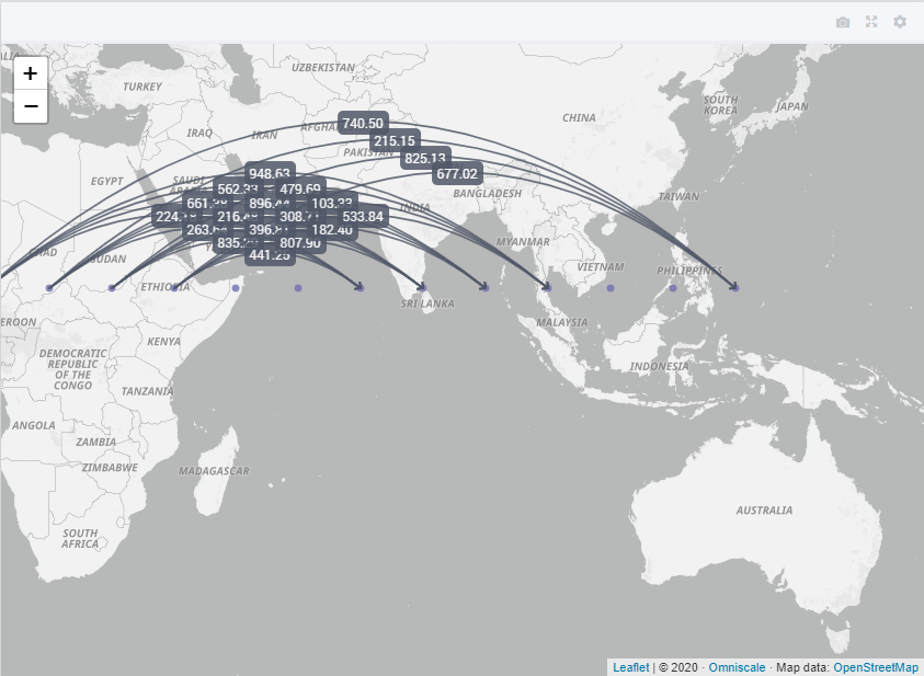
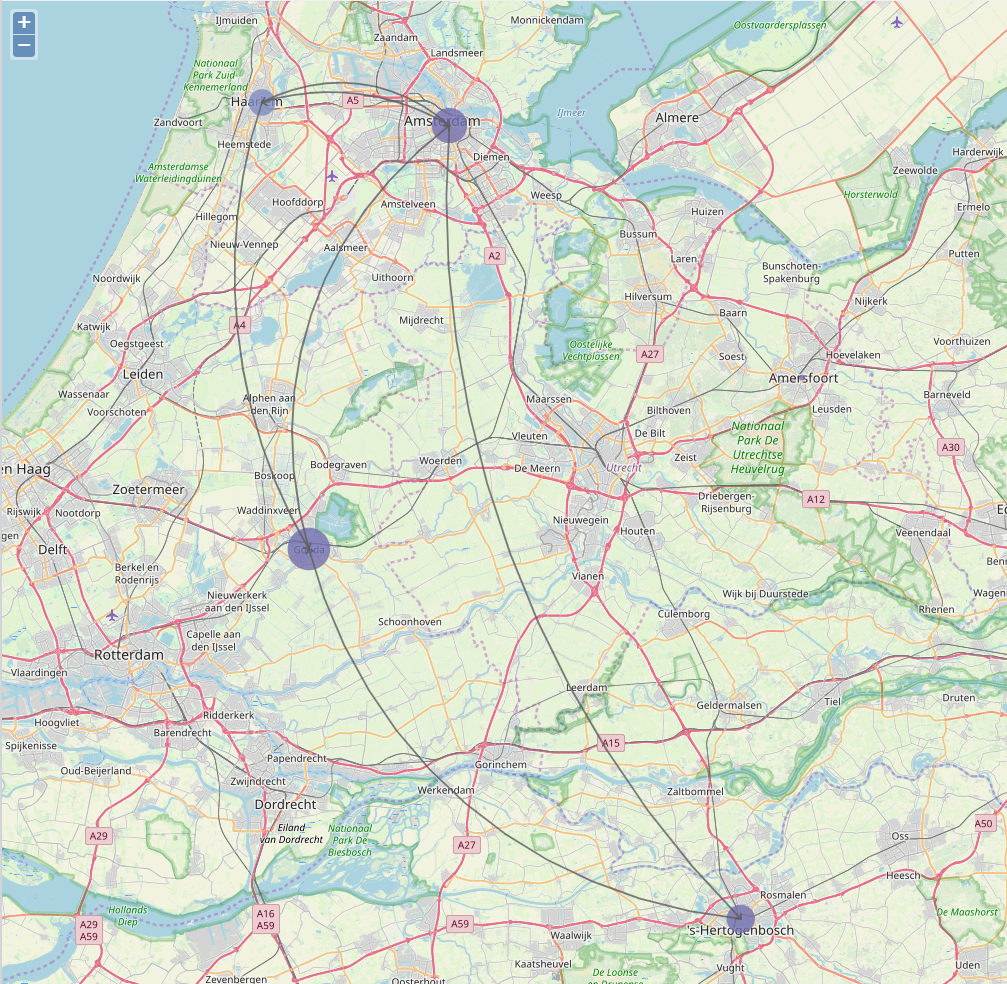
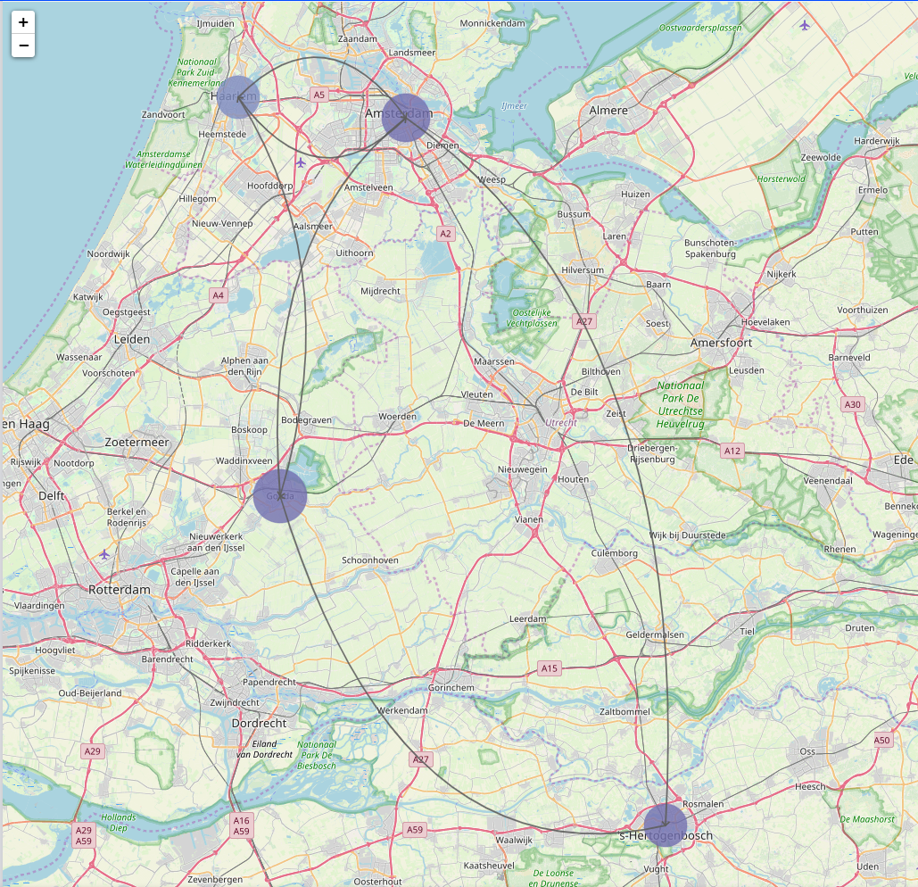
Arcs will be drawn differently. Earlier we used a custom algorithm to draw the arcs. Now arcs drawn from right to left or bottom to top will be drawn with a downward curve, and left to right or top to bottom will be drawn with an upward curve. This makes it slightly more intuitive. The users will be able to determine the direction just by the way the arcs are drawn.
We have improved the relative sizing algorithm for node sizes by relating the surface area of the nodes in each node set instead of relating radius of the nodes. This improves the visual representation of the node sizes as the area is twice as big if the node size value is twice as large.
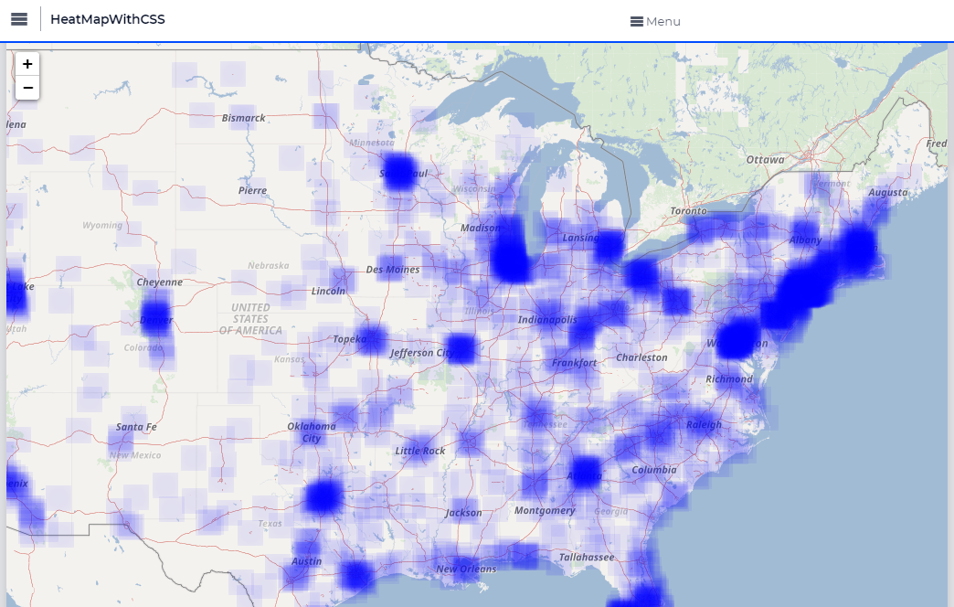
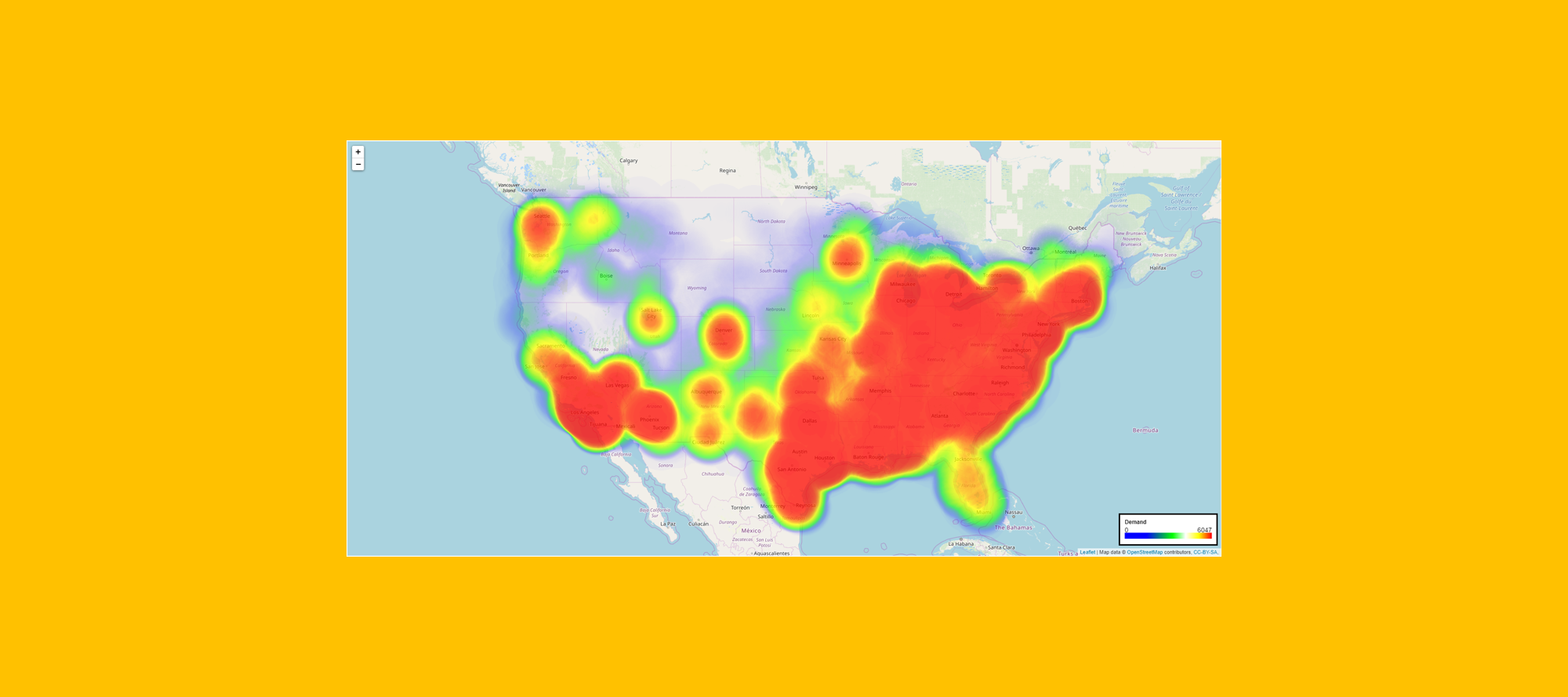
Map widget with OpenLayers (Current)
Map Widget with Leaflet and improvements
New Features that can be expected:
Maximum Reference Value: We are introducing a new option for each node set such that node sizes are calculated based on a defined reference value. If no value is defined, the sizes are relatively sized based on the maximum value of the size identifier. This allows you to relatively size nodes from different node sets with the same reference as well.
Nodes with size 0 or NULL will not be drawn anymore.
Ability to add icons to nodes. The icons will be drawn inside the nodes. It makes it easy to represent different node sets like Factories or Depots etc, with icons.
Ability to control the order of nodes sets to determine which node sets should be drawn on top of others in case there are overlapping nodes.
Custom tooltips for nodes and arcs. Similar to other widgets, we will extend the ability to define custom tooltips for nodes and arcs to display information.
Enabling annotations on arcs as well. You can apply annotations to arcs and change styling similar to nodes. The custom styling will apply to the arc as well as the label. You need not have different CSS for each element of the arc.
Store focus on arcs. You will be able to leverage store focus functionality on arcs just as you can on nodes.
Improved performance. The map will be able to accommodate higher number of nodes and arcs.
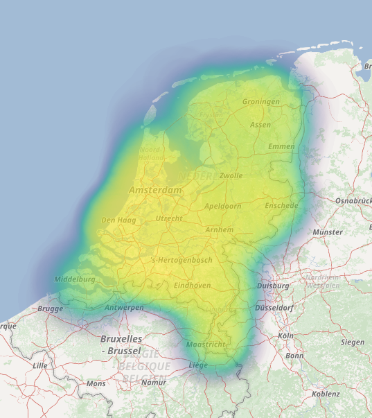
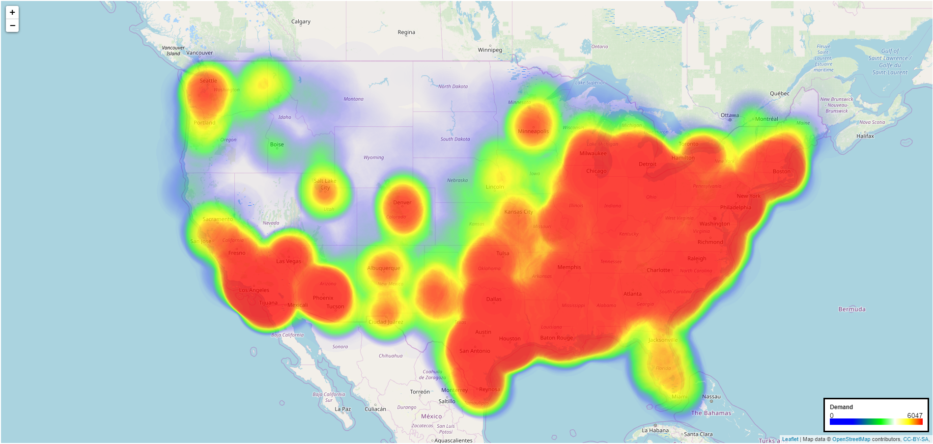
Heatmaps on the maps. Heatmaps can be used to show additional information to help users with trends or other intuitive data.
HeatMap Example:
We value your feedback and would love to hear what you think of the above list.
Thanks,
Pratap
Page 1 / 1
I really like the heatmap. Can’t wait to see it released!
Hi @Pratap Kumble, is there a way we can modify the desired granularity of the heatmap?
I want to display some volume density on Dutch postal code 4 level. there are around 5000 different points in the Netherlands. If I try to display the heatmap, it is not very useful:
Heatmap on postcode 4 (e.g. NL1234) level
How can I make this more granular?
Hi @Richard,
Currently, there is no way to control any setting on the heatmap.
As a workaround, you could plot the nodes and control the effect via annotations. Do let me know if you need some help there, I can work up an example.
I hope that helps?
PS: We did think of some options for the heatmap and it’s on the roadmap.
Thanks,
Pratap
Hi @Pratap Kumble,
thanks for the info. Would love to see more options coming in the future! At least good that I did not miss something.
If you could share an example, that would be great.
Thanks!
Richard
Hi @Richard,
I tried to create something close to what the heatmap can do but I could manage only so much with custom css.
There are 2 main draw backs to this:
Single color - Atleast I could not find a way to apply the gradient that we have in our heatmap. There could be other tricks, I could manage only this.
The blur effect gives a squarish look to the svg.
Attached is the model as well so you can experiment and see if this fit your need.
You can experiment with change the values for
the color obviously :)
Opacity value in the CSS file
stdDeviation value in JS file
MaxRefValue in the scalar that is set for the Maximum Reference Size to the node set. This is to control the size of the node.
Do let me know if this helps!
Thanks,
Pratap
Dear Community,
It has been about a year that we introduced the upgraded Map widget with all the new features that make it a very powerful widget. The list of features can be found in the Release Notes or the Documentation of the Map.
Since there would be some significant changes to the new version (mentioned in the article above), we had provided an option in the Experimental Features to “Ignore Map Upgrade” which would roll back to the older version.
We believe that everyone using a map widget has had the opportunity to upgrade and benefit from all the new features in the latest map version.
We will be removing the experimental feature from the next release to roll back to the older version and all map widgets in the application will automatically be rendering the latest map version.
This also helps us maintain our code and keep the WebUI clean and light.
Thanks,
Team WebUI.
Hi,
Is there any update on the heatmap (expected) regarding the question Richard posed 8 months ago about granularity?
I tried to use it for NL postcode areas, but for that granularity it is useless right now. Would be great if this granularity will be supported!
Wim
Hi @Wim,
We have not come around yet to add more options to the heatmap for the map widget. Our current focus is on building the new framework.
We will look at the effort and see if we can work on this in this quarter!
I will provide an update as soon as we have this planned.
Thanks.
Pratap
Hi @roberto.mattos,
We do not have an option to convert the map to the greyscale tiles as yet. But there is a CSS trick