Update: Thank you all for your participation in the poll for this Idea. The poll is now closed.
Dear Community!
Hope you all are safe and in good health!
We are extending the Grid Layout on Side Panels and are also planning to introduce a couple more sizes for the side panels so that you can utilize the grid layout in an efficient way and make better use of the real estate on the side panel.
Currently, the side panel has one fixed-width size of two columns. We want to introduce two more sizes, resulting in Wide, Medium, and Narrow. Narrow will be the current size available.
Before we go ahead and introduce this, we wanted to check with you on your preference and how you would like the functionality to work.
We would like to know your preference on the implementation of these sizes on the WebUI. How and where these sizes should be set and how they should behave?
- One size for all side panels across the application. You can select one of the sizes and that will be set for all side panels across the application. You can set this value in the Application Settings.
- Defined size per page. You can select the desired size of the side panels per page. The side panel will open with that respective width on the page. You can set this value in the Page Settings.
We will also provide a preview option when configuring the side panel so the widgets and end-user experience remain the same. - Size per side panel. Set a size for each side panel. You can set the size in the Side Panel page settings when adding widgets.
There are pros and cons for each implementation, the main being:
- One size across the application
- Pro - Consistency is maintained across the application for end-users.
- Con - Size would be dictated by the biggest size. Some side panels may not require that size and might look very empty. Poor use of the real estate.
- Standard size per Page
- Pro - Maintaining consistency on the page when the user interacts with the side panels.
- Con - Here as well some of the side panels may not require that size.
- Size per Side Panel
- Pro - Different sizes allow app developers to select the correct size based on the content.
- Con - Inconsistency when the users interact with the side panel, different sizes would result in a lot of movement on the page.
We would also like to know your thought about the different sizes: Would you prefer to have
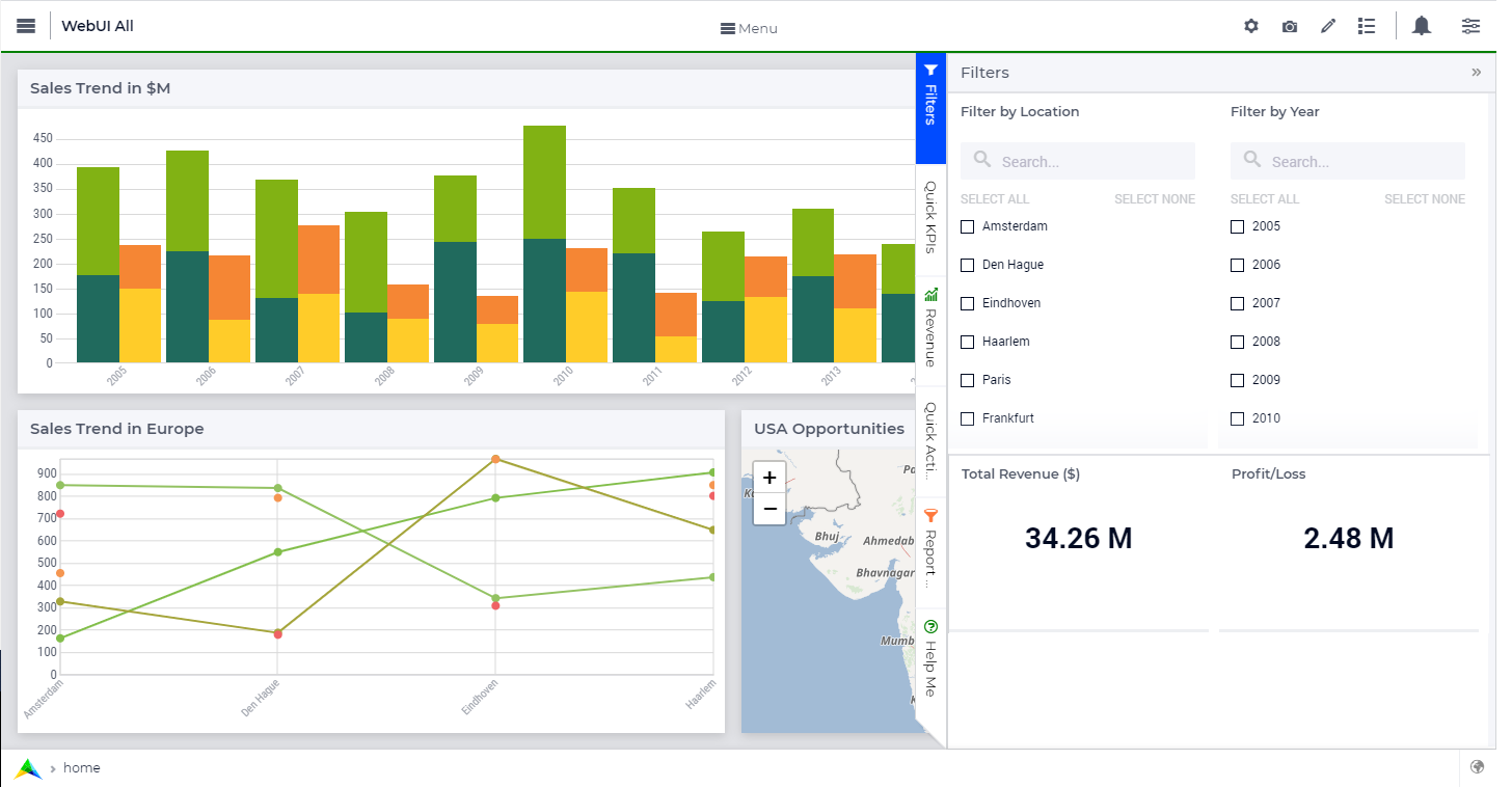
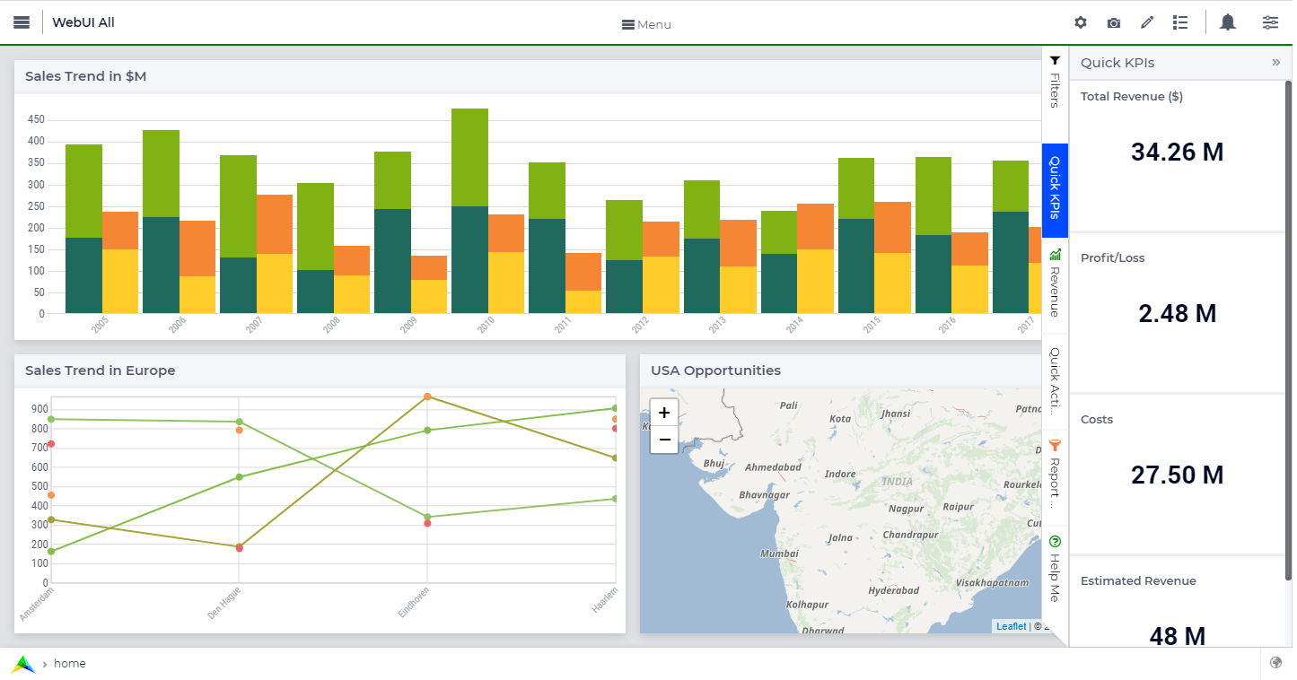
- Three sizes - Wide (4 columns wide), Medium (3 columns wide), and Narrow (2 columns wide) - This is our current preference!
- Two sizes - Wide (4 columns wide) and Narrow (2 columns wide)
- Custom - Ability to define any size.
To give you a perspective of the different sizes:


We also plan to introduce a feature where the app developer and end-user can make the side panel a part of the page that will then not overlap (overlay) the widgets.
Do also leave your suggestions and feedback. They are valuable and help us!
Thanks,
Team WebUI.


