Frequently we run into the limitations of resizing widget. Here is one concrete example which could be solved if we can hide the table header.


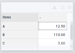
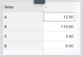
In our application we have a table with a 1-dimensional parameter with 4 items. With a table widget of row height 1, we don't see the last item unless we scroll. With a table widget of row height 2, we have a lot of redundant white space we want to use for something else.
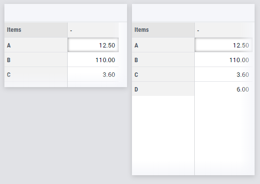
All items would be visible in the smaller widget, if we could hide /collapse the header. Is there is a way we can remove the column headers via CSS?


As a side note, I believe grid we are limited to when placing widgets is too coarse.

Interesting question, Paulus. Which I'm sure many will find interesting because everybody is always looking for ways to optimize the usage of screen real-estate.
I don't think having a more finely divided grid would (really) help. There's always something that just does or does not fit for any sizing. 
Personally I'd rather see an option that allows a grid area to take up as much space as needed (by its content). Something we're working on as a feature for the new Page layout functionality that Gertjan has already announced in his Product Owner update. So hang on in 2020.

But, right now, to make more use of the space within the (table) widget, solely by using custom styling, I see two approaches, as far as I'm concerned.

  • hide the entire widget header/title (but for non-developers only of course, and when no other actions are needed from the header: you will lose access to all that when hiding this part)
  • hide the row and grid headers

The first is pretty easy to achieve. 

html:not(.developer-mode) .widgetdiv vdata-widget\.uri="YourWidgetURIHere"] .awf-dock.top {
    display: none;
}

Replace 'YourWidgetURIHere' with your own widget's uri, of course.
Find it by inspecting the title bar with your browser's developer tool and going up the element tree to the <div> that has the aimms-widget class on it too. It will have the data-widget.uri attribute.

Please note that due to the period in the data-widget.uri attribute name, we have to escape it in our css by preceding it with a backslash… Something I overlooked when first answering this.


If you know how to work with annotations, you could use that approach too and replace the hdata-widget\.uri="YourWidgetURIHere"] part with the class that your annotation yields.

Hiding the part that you actually requested to hide, the headers above the table, seems obvious but currently isn't, because there is quite a bit of explicit (and dynamic) sizing going on.
So in order to urge the contents to align to the very top, we need to override some styling:

edata-widget\.uri="YourWidgetURIHere"] .titleheader-viewport,
,data-widget\.uri="YourWidgetURIHere"] .colheader-viewport {
    display: none;
}

rdata-widget\.uri="YourWidgetURIHere"] .rowheader-viewport,
odata-widget\.uri="YourWidgetURIHere"] .gridheader-viewport {
    top: 0!important;
}

}data-widget\.uri="YourWidgetURIHere"] .right .ui-scrollbar {
    top: 0!important;
    height: 100%!important;
}


Doing this will hide the sorting options for any columns too, since they're part of the hidden headers.

As usual I do have to ask you to make very sure that your app keeps working as intended. 
I only did a superficial trial of this on a simple model. So check if you can still interact with everything.

See if this gets you where you want. If not, check back here because there might be more creativity to add.


In the meantime we hope to help you (and everybody) with nicer page layout options next year! (and sorry, no specific due date yet on that specific feature)


Hi @Paulus 

Was Edo’s answer sufficient in answering your question?


Regarding page layout upcoming changes Edo mentioned, see the December product update for more details - and keep an eye on discussions in the Roadmap forum ;)


I’ve edited my anwser above to show ever so slightly different code examples.

As it turned out (Gertjan was nice enough to ask questions about it), the css selectors that refer to the data-widget.uri attribute were invalid due to the period in them. They would be ignored.

So in order to make it all work, I added a backslash before the period in all those css attribute-selectors in my example.

... .data-widget\.uri=YourWidgetUri] ... {
...
}

Sorry for not noticing this any earlier.


Hi @Edo Nijmeijer,

Thanks for your suggestions!

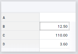
Unfortunately, your second suggestion is not 100% working, since it doesn’t move the data up. Causing the data and row headers to mis-align.

To make clear to you (and others reading this) what the effect is, let me share some screenshots. 

Original:

Original

Removing the title bar - @Edo Nijmeijer first suggestion:
 

Removed title bar

Removing the column headers - @Edo Nijmeijer second suggestion, causes a misalignment of row headers and data:

Removing the top headers

If you have a suggestion on how to solve the alignment, that would be much appreciated!


That looks as if one of the new styling rules is not applying, and I think I see why that might be: I made (another, sorry) mistake in one of the class names.

[data-widget\.uri="YourWidgetURIHere"] .rowheader-viewport,
[data-widget\.uri="YourWidgetURIHere"] .grid-viewport {
top: 0!important;
}

That’s the second block of the ‘code’ I showed before. It now says .grid-viewport {... instead of .gridheader-viewport. I must have been copy-pasting from the row/colheader to hastily there.

Does it work if you remove `header` from your own code, in that location? It should.


Tnx! With this modification it works. 


To summarize, the code I used now reads as follows:

.aimms-widget tdata-widget\.uri="YourWidgetURIHere"] .titleheader-viewport, .colheader-viewport {
display: none;
}

.aimms-widget tdata-widget\.uri="YourWidgetURIHere"] .rowheader-viewport, .grid-viewport {
top: 0!important;
}

.aimms-widget tdata-widget\.uri="YourWidgetURIHere"] .right .ui-scrollbar {
top: 0!important;
height: 100%!important;
}

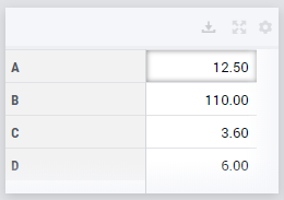
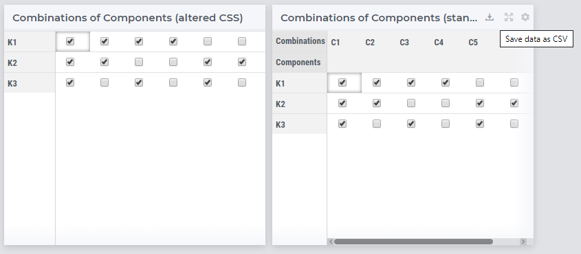
And yields this result:
 

Table column header removed


Like to make a remark on the suggestions made (also for other readers) that customizing CSS can remove certain functionality of widgets that we as Product Development team of AIMMS assume exists.

For example, the above adjustments could lead in the future to unexpected behavior as removing the title of a widget, removes the Settings option for Developers and End Users, but also the Download option and no specified Widget Actions will appear.

Similarly, removing row headers can result in hard to interpret results as you can see below:

Example of removal of header area of a table (title area with options still available)


This is not to discourage using the above (I love the creativity and possibilities shown!), but to make sure you are comfortable with these changes and any - next to the positive effects - negative side effects.

Please know these CSS changes are not supported functionality and any issues fall outside the responsibility of AIMMS (provided “as is” via this community). So please keep track of your custom changes so you can easily filter/remove them upon upgrade issues.


Reply


Didn't find what you were looking for? Try searching on our documentation pages:

AIMMS Developer & PRO | AIMMS How-To | AIMMS SC Navigator