Hi all,


playing around a bit more with the webui and having some more questions.

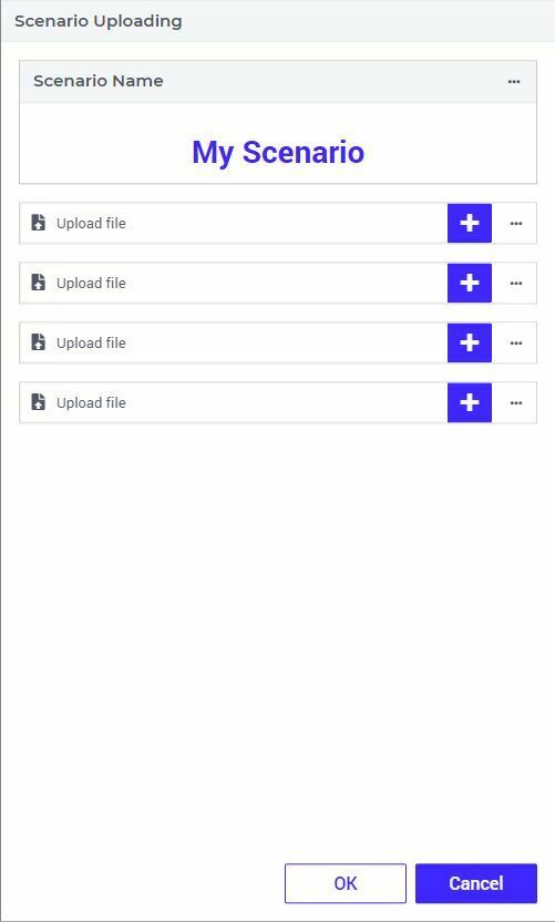
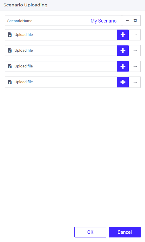
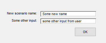
I want to create a dialog page where the user can upload a couple of files and give the name of the scenario into which these input files should be loaded (potentially some other text based input).


In the original winUI, I would create something like this (as example what I want to achieve):
 

Now I am trying to achieve this with a dialog page in the webui, but when I want to add a scalar, I get the following:
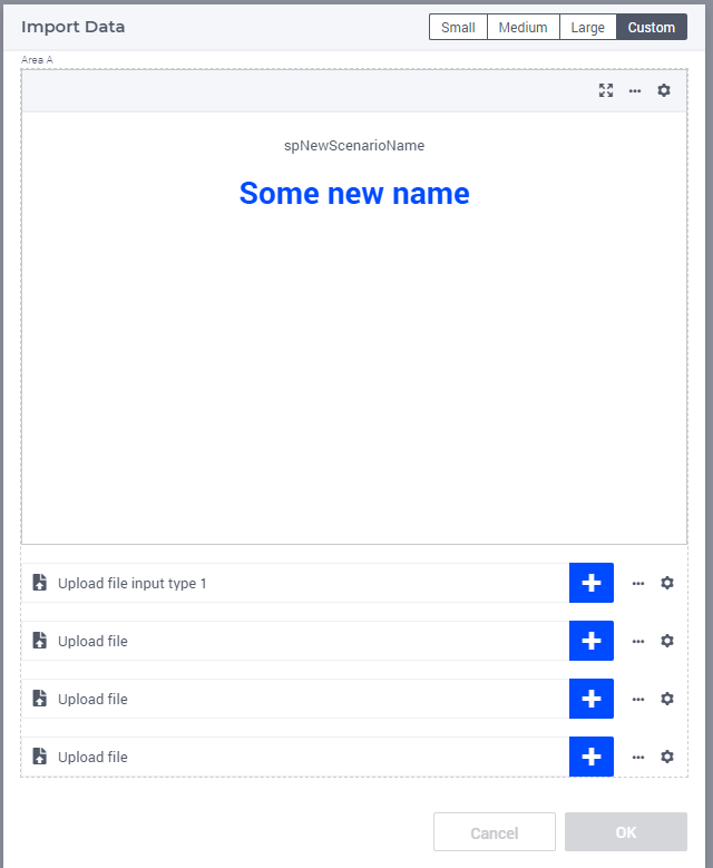
 

Where I think there is way too much emphasis on this scalar value.


I can make use of the experimental feature of compact scalars, but then it looks weird with scroll bars. Also not sure if I can modify the size of the ‘header’ (label showing now spNewScenarioName) and the actual input field:
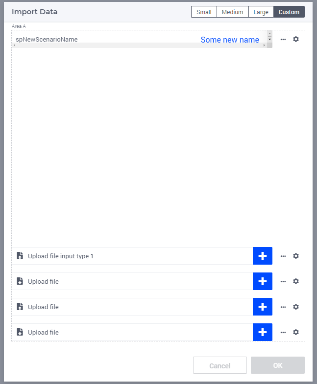
 

I think the closest I can get this is creating a table with either scalars, or making a set with ‘headers’ to be put in the labels and create an indexed string parameter over this. That way, it starts to look like this:
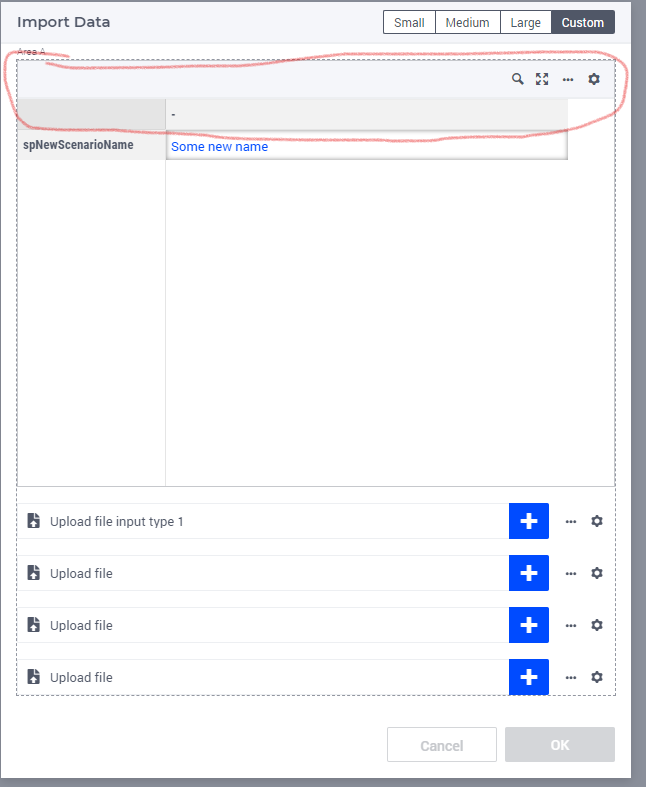
 

which gives me more flexibility, but then I would like to just get rid of the title bar and the first grey bar (the area indicated in red)


I do understand the webui works differently, but what is the recommended way to get one or more (string) parameters from the user with custom labels in front of it?

Using AIMMS 4.98 for this at the moment if that is relevant.

Hi Guido,


I played around a bit with your problem and I managed to come up with this:


The trick in assigning less space for the scalar widget, is to not use a standard layout for the dialog page, but a custom layout. I started out with standard layout 1, but refined it slightly such that the upper area (called ‘Area A’) is allowed less space as compared to the bottom area (called ‘Area B’).

You can find some useful documentation on custom grid layouts here. My personal experience is that once you get the hang of it, you can basically create anything you like when it comes to layout.

If you want to experiment with my setup, please find my sample model attached (please note that I also changed the ‘Gridautoflow’ setting for both areas to “row” instead of 'column’.


With kind regards,

Mischa


Hi Mischa,


this looks promising. Will investigate this a bit further. Did not think about dividing the total space in multiple areas for this reason.


Guido


By the way: the strange scrollbars in the compact scalar were a bug that was resolved in the latest 24.2.1 release. So you can go even more compact than the previous attempt (this is with a

	"gridTemplateRows": "0.05fr 1fr"

in the area space allocation - and the scalar set to compact mode):


Reply


Didn't find what you were looking for? Try searching on our documentation pages:

AIMMS Developer & PRO | AIMMS How-To | AIMMS SC Navigator