Optimization models have a lot of information that needs the user's attention to either review, compare or change. Showing such information on pages usually compels the user to scroll endlessly or scroll up and down when comparing data or switch to and fro between pages.
One of the reasons for introducing the Grid Layout was to bring consistency and familiarity within the application. For example, majority of the screen could be used for data widgets, and the left- or right-hand sides can be used for user actions.
We also introduced UI components like the Side Panel, Dialog pages, and Status Bar such that common elements could be placed in these components to save real estate on the pages and it becomes easier for the users as well.
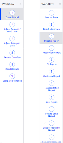
Even though these components help in many ways, some applications still have a lot more information to show that usually end up in the page having a scroll or where the workflow panel is being used show sub-steps, as illustrated below.

How do you or would you approach such a scenario? We would love to hear your innovative solutions to deal with these data heavy pages and applications. Please share in the comments.
We also gave this some thought and wanted to understand if any of the below approaches will help in making applications more intuitive and less tedious.
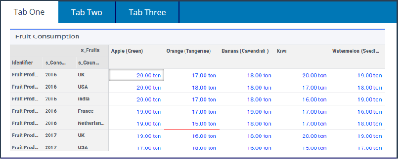
- Tabbed sections on pages - The ability to have tabs that can have different reports or data and does not refresh the page, but acts as an extension of the page. Something like the illustration below:

These tabs can then be placed in different positions. Top - left or right or like in excel bottom left.
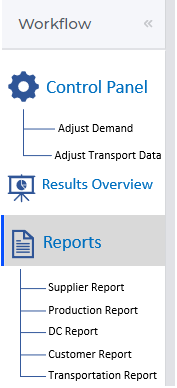
- Multi step workflows - Ability to have substeps for each step of the workflow. In a way having a two dimensional workflow. Although this will be a page switch, it keeps the user in the flow. and does not make the page look cluttered. Something like the illustration below:

Do let us know which one you like, and if you think there is a need for such a solution as well.
Thanks,
Team WebUI


