Hi Bon,
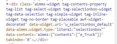
Good oberservation, which, unfortunately for you, is correct: the items in the dropdown are kept apart in different parts of the document tree. It makes it easier for them to be hovering over other items.
But it also means there’s no css-setup that can bring them together.
Some background: for the component itself they are technically tied by the id, but since that is automatically generated, based on the presence of other dropdowns too, there still is no stable id to use in your css, nor would you be able to use it ‘dynamically’ in css. And the order of opening your dropdowns also plays a role. Just look at the id on the <ul> within the select2-drop element you showed above: it varies. We really are out of luck.
Time to think about alternatives. Perhaps it is manageable to work with multiselect lists that are shown and hidden based on other ‘circumstances’? You could style all of those individually. Otherwise I’m not too sure right now.
How can the ‘function’ of these dropdowns be so different that you feel like you need to style them this way? Does that signal something?
Thanks, @Edo Nijmeijer!
I am creating something for a client so they can FAR more easily adjust styling. Thus I’m not designing around a project, I’m designing around the prospect of many projects.
If I can’t do it, that’s fine. It'll just not be available.
Glad to hear you’re considering the options most relevant for the situation. Even if they’re lacking and even if the situation is still future. That is always the way forward 
Once again, thanks for asking here, so others benefit too.


