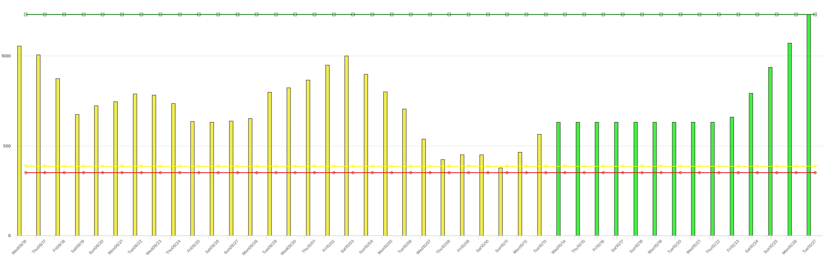
Hi Chia, thanks for asking because it allows me to highlight the use of annotations and custom styling again.
I’m of course not sure if you’re familiar with annotations and adding .css files to your project to achieve custom styling. I’ll take the easy route and assume you know how to do add annotations to your identifier used for the line data. And that you can create, or add to, a css file in your project’s resources folder. Also, I’m going to assume you’re using the (more modern) Combination chart. You should be, since I see you have bars and lines together.
Annotations and css documentation could be found here, by the way. Also, some annotations related to the values or names of the identifiers might already be there, by default, ready for use-cases like this.
The annotations will end up on the elements within the chart. My favorite way of exploring my options there is to open the Developer Tools of your browser (F12 if you’re using Chrome on Windows), pressing Ctrl-Shift-c to trigger the element selection mode and then hover over the ‘circle’ that is the element you are wanting to hide.
You'll probably find it is a <path> element, with a bunch of class names defined for it. In your case, it should have the class highcharts-point and many others. If you defined an annotation, like for example “Demand”, then it will also have the class annotation-Demand. Which allows us to have a definition like this in some css file
.highcharts-point.annotation-Demand {
    display: none;
}
So we combine the two classes to specifically target the points with that annotation. Hence no space between the two class names. They’re on the same element.
If you want to make sure this dots are only hidden within a specific instance of this chart Widget, then you’d better also use the widget uri in your css:
[data-widget\.uri='your widget uri here'] .highcharts-point.annotation-Demand {
    display: none;
}
Note the space in between the selector for the widget uri attribute and the two class names. The class names occur within the element that has the attribute.
That should lead you to your desired change to the appearance of the chart. Indeed, there is no other way for it (because it is not a built-in chart option).
With respect to your second question: those are all options available as Chart Settings. The y-axis can have a Min and Max value, which will ‘frame’ the chart. ‘Step size’ is also an option on that same Tab, allowing you to manipulate how the grid and ticks get distributed. Each one of those can take a parameter too, for full control from the model.
When left unspecified, the Combination Chart will just attempt to show all data points and adapt the vertical axis accordingly. Depending on the size of the widget area, you might or might not see concrete labels for intervals you think you’d expect.
Maybe this link to Chart Settings documentation can also assist you.
Hope that helps in getting you closer to what you are trying to achieve. If not, don’t hesitate to ask here again, of course!