Hi,


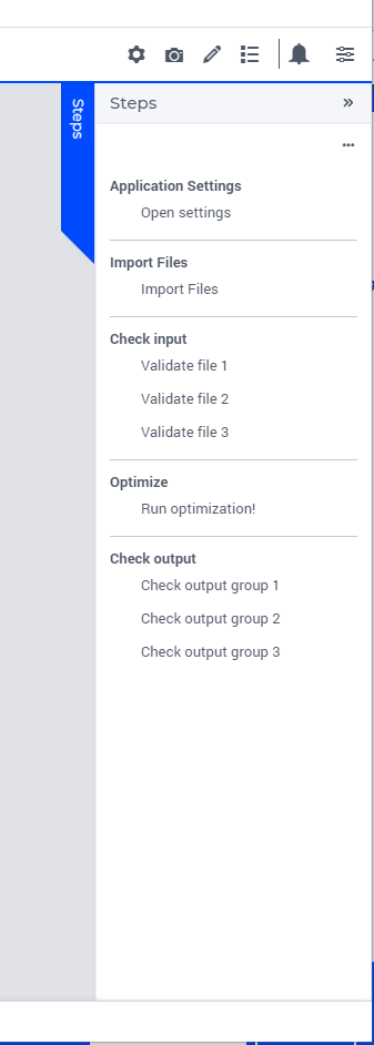
Playing around a bit with AIMMS again and was looking first at using a workflow, but the problem I think for me is that changes I make in a later step could invalidate an earlier step again.


For example, one step in the workflow would be to request the user to upload 3 files, while next steps in the flow would be fixing some of the items that were just imported. However, I don’t think I can make it three separate steps in a workflow because changing something that was read in from the 3rd file could invalidate something from the first file.


So based on earlier conversations, I was looking at using the list widget in a side panel because this can easily give me the non-linear behavior. For each of the three input files, I would have one line in the list widget and I can use green checkmarks / red crosses / yellow warnings to indicate which blocks need to be investigated.


Is this indeed a good approach for these kind of things? 


With regards to the side panel, when adding the list widget to a side panel, it does not use the full height of the side panel for me steps widget:
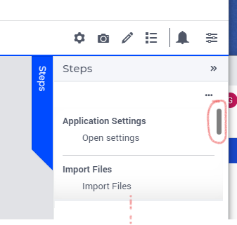
I still have two or three more groups below the Import files (at the red dots I put) with some sub items. Using the scroll bar on the right, I am able to scroll down, but if there is enough of space, I would assume the list widget to use all of the height?


Another question related to this, is it somehow possible to set the default of the sidepanel to be visble instead of having the user click on the steps when opening the application? 

Not sure if I know what I am doing here… The default layout that was used was layout-11. I changed it around a couple of times and now it is working as I would expect: the list widget is now using the full height. Putting it back to layout-11 does not make any difference anymore ?!? 


Still the question remains whether I can make the sidepanel open by default or even make it permanently available (although I guess this is not recommended because of the screen estate it takes away….)


Hi @gdiepen ! I just tested here, and for me, when adding the list widget on a side panel using layout 11, it works fine. So I am now wondering which version are you testing with? 

About the sidepanels, no, there is no native way to make them open by default. If you want, you can add this to the ideation section!


And, about your workflow: if I require 3 different uploads, I’d either have the upload widget together with the table the user will need to check, one per table, or all in one page using the page scroll. Saying this because workflow have the ‘error’ feature that is very visual to where the error is if there is an error. Note that I am not saying don’t use a list widget to list all errors, I am saying: use both. With a red workflow step, if the user go in and see a sidepanel listing all the errors, that will make the his life easier!


Hope this helps.


Please take the following with the disclaimer that “I don't know javascript”:

I would guess you can force open the side panel with Javascript.


Hi @gabiservidone ,


need to think a bit more about the workflow. Suppose that all input items are actually checked and I can start the optimization, I now have a couple of more pages for the output.

What is the best/recommended way to deal with that? So after the solving is done, I now having something like 5 to 7 different pages where I can go through the optimized results through different lenses. Those pages should not be separate items in the work I would say


@luispinto That was my guess also, but no clue how to do anything with that in AIMMS (I follow the same disclaimer 😉). 


Let me correct myself here, there is a native way to make a side panel open on page open. Create a new procedure with: 

webui::OpenSidepanel('sidepanelID');

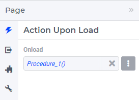
And add this new procedure to the “onload” of that sidepanel’s page. 


Now, about the workflow, I agree with you, it should not be different than the input pages. But then I don’t understand the problem here. You don’t want to use the workflow for result pages, is that it? Why don’t you use a free workflow for it? Free as all active and clickable. 


Thanks for the tip about the OpenSidePanel procedure.


With regards to the workflow, I just think I need to play around a bit more and try to implement a couple of different workflows and see what works and what doesn’t. In theory, I can just modify the workflow to be a free workflow the moment the user is done with solving the problem and only has the output pages. The workflow panel could then just show only the output pages and function as some sort of tab-selector. Until the user indicates another input file should be read, in which case the workflow changes back to the restricted workflow again.


I think my main problem is that some of my ideas might still be very much linked to the ‘old’ winui way of thinking/designing instead of the webui. I see a similar thing when I want to have a small explanation left or on top of a widget that gives a bit of explanation (e.g. when I want to create a dialog with three upload widgets and give some explanation about each upload widget to the end-user, which file it is for, etc). In the winUI, this was very easy by adding a text object where I could add some info. In the webui however, this type of design seems to be not preferred because I can’t add just a simple small piece of text, it always becomes a very large block that takes quite some space.


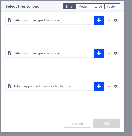
For example, the following dialog I created for letting the user select 3 different types of input files:


In the winUI, I would have created the three separate uploads with a text above/left of it with the explanation about the input file type that this particular upload box is for. Also, after the upload is finished, it will show for some time that the upload is done, but after that it will change back to the above title text (which removes the indication that I have uploaded the file). One way I would solve that situation in the winui would be to display a green checkmark (either text or image) to indicate the upload for this input file type was completed. Is such a thing possible with the webui? Or should I learn to embrace a new way of designing with the webui?? :-)


Well, I’d say that if you don’t want to embrace WebUI way of thinking now, you will one day or the other. Just because that by understanding it and using it with its full potencial, you will be able to create not copies from old WinUI projects but better new projects with better UX/UI. 

For intance, for your dialog page, you can either do 3 text widgets together with your upload widgets (similar to your WinUI), and solve the sizing by creating a unique Page Layout for this dialog, adding the text widget to the smaller areas. See this article: https://how-to.aimms.com/Articles/434/434-reindeer-pairing.html#page-layout

Or… use a tooltip for each upload widget. Then by hovering the user will know what action he should do by upload. 


Note that both ideas (tooltip and text widget) can be created by a string parameter so, you can change its value after a solve, for instance.  


I do understand I need to start embracing the webui (though the moment that I am working on developing a poc on the model part, I will still use the WinUI because there is really nothing that beats the power of the winui pivottable for me 🙂 )


I have tried some things with making smaller areas for text, but the alignment always seems a bit tricky. Also, with these smaller areas for text widgets I have the feeling I am wasting a lot of the screen estate.


After some playing around, in the case of the three files, I have actually created a slightly different approach: 

Two columns and 3 rows (1 row for each of the files). Per row, on the left I added a table with some information about the file that was loaded (number of lines, filename, timestamp it was loaded, first ETA, last ETA or the error that occurred during loading) as separate scalars  in the table. On the right of this, I added the upload widget for the xlsx file and after that file was uploaded, the table on the left automatically gets updated. This way, it is right away clear if the file was read or not and I don’t need to have some explicit text.


I also ended up implementing a double workflow:

  • Input / validation / optimization related workflow that is strict about the steps (you can’t go into optimization before input and validation are done). After the solve is done, I open the first page of the ‘output-workflow’
  • The output workflow is a set of pages that show the results through different lenses and allow the user to easy switch between them.

Now only fighting with the Open/Close state on the child-pages in the input-workflow. It seems it is automatically closing all of the time. I do see that it should be possible to control this state, so will try to see if that would work tomorrow (pretty sure that this should work, just did not have time at the end of the day anymore 🙂 ).


Reply


Didn't find what you were looking for? Try searching on our documentation pages:

AIMMS Developer & PRO | AIMMS How-To | AIMMS SC Navigator