Tips from Total Design’s Thomas Pleeging
As you know, AIMMS has been on a journey to improve user experience, both in our own products and through our WebUI, which provides a toolkit for AIMMS developers to deliver a great-looking user interface in their Apps. The importance of UX cannot be understated and it’s not just about cosmetics. As this article in our Project Success series explains, your app should look appealing, but it should also fit into your user’s workflow, reduce friction and present data in a seamless way. How can you achieve this? We spoke with Thomas Pleeging, a guru for all matters UX and former Senior Designer at Total Design, to get some practical tips. Thomas has worked in design for 10 years, six of them specifically devoted to UX. He has worked closely with our team for nearly three years now. Here’s what he had to share.
UX and UI, you often hear these terms in concert with one another. What do they actually mean?
Yes, that’s right. UX stands for User Experience Design and UI for User Interface. UI is what you see on the screen. The buttons, the links, the menus...that is the interface. But of course, the entire experience that you have with an application is broader than that. It also has to do with your app’s speed, how the user goes through an application, what functionality is available at any time, and where you see it. Basically, UI is part of UX. While UI is the pixels on the screen, UX is the entire experience a user has. In a way, you can say that UX is a collaboration between design and development.
Why is UX so important?
Well, it’s very important to realize that for users, using software is not a goal, but a means to an end. They are interested in using the software to solve their business issues. That’s what they want to focus on, and the app should support that and not get in the way. To have a positive experience and a good flow through the software, you need good UX. A good and well-thought-out UX helps you focus on the actual problem and therefore, it increases value for end users.
Generally speaking, what are common mistakes that developers make?
I think the most common mistake developers make is not thinking about the user and their needs, but just putting an interface on a database. Almost any website or app consists of data that gets communicated to a user through an interface, but that’s not what brings value. What results in value is showing the right information at the right time.
What I see often is that developers just put whatever data is available on the screen, but maybe the user only wants to know what deviates from the norm and not everything. Often, when presenting new features, developers leave the user’s needs out of their demos. They tend to start with features and not asking who and why. This can be taken as a sign that they did not consider building user stories from the beginning, “as X user, I need Y to achieve Z.” Questions developers should focus on include:
- Who is the app for? Is there one user or are there multiple users?
- Are they technical or business-oriented?
- How often will they use the app? Will they use it once per week or is it something they will use once per year and may forget how it works?
- Is there a step in the application shown during a meeting, so many users look at it at the same time?
- Are there logical steps to the flow of the application?
Developers should ask these bigger questions first, before diving into data modeling and features.
Which resources or advice would you give to teams that want to understand UX principles but don't know where to start?
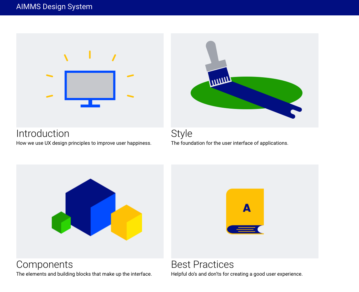
The number 1 resource is always your user. Asking your user what their needs are and what they run into should come first. We also have the AIMMS Design System, where developers can find principles, guidelines and components to build web applications with great UX on the AIMMS platform.

Generic resources I would recommend are:
- Refactoring UI
- UI Patterns
- UX and Usability Research from the Nielsen Norman Group
- Designing UI e-book
How do you balance time to launch vs great UX design?
Well, many times, the impact on the technology or development is not too big. It’s more about choosing what to do and where, rather than making something very complex. Generally, you go for an MVP (Minimum Viable Product) and then think about the next step. Not everything has to be in the first version. First, you release a simplified version, then gather feedback and continue improving from there.
For AIMMS developers, paying attention to good UX means a little bit of extra work that has very rewarding effects down the line. The AIMMS WebUI already offers all the building blocks, it’s just where you apply them.
For more insights on this topic, check out:


