An interview with UX Designer Thomas Pleeging
AIMMS takes pride in providing a great user experience, both in SC Navigator applications and through our WebUI, which provides a toolkit for AIMMS developers to deliver a great-looking user interface in their Apps. Often, translating our supply chain expertise into a great UX does not come easy, especially in robust apps that have multiple types of functional users. To ensure we have a user-centric approach, we work with user experience experts. We spoke with Thomas Pleeging, former UX and Senior Designer at Total Design, to get his take on this UX improvement journey and uncover some of the highlights.
Thomas, as an agency, how do you ease the collaboration between the business (supply chain) side, design and development?
Our standard way of working starts with a session. So, we organize a session with the product owner (who typically brings the business or supply chain expertise), the developers (who know about data modeling and the technical side of things), and someone like myself (who specializes in UX). During these sessions, I learn how supply chain concepts work in practice to really understand the end user’s needs. Sometimes it takes a bit of time (several sessions) to understand these concepts. From there, I usually mock up some sketches.
You mentioned that some concepts are complex. Can you share an example and break it down?
Yes, sales and operations planning (S&OP), for instance, is quite a complicated concept. It takes time for someone like me, without expertise in the planning or supply chain domain, to really understand it. So, I get together with the experts. They explain how this process works and what it is, and we do a live design session to see how this should influence the UX of the app. In other words, we translate their know-how into designs.
This often results in interesting discussions. For instance, we ask ourselves: Is it necessary to show all the information? Should we organize information in a certain way or only show the outliers? The domain experts know what the user wants to achieve, often through conversations with customers. Talking with them helps me translate the process of doing supply chain optimization into UX and finally, UI.
What makes S&OP such a complex concept to translate into an app’s design?
Well, S&OP is a business process that balances demand and supply. What makes it very complex is that there are several different users in there. About six different types. So, you have people on the demand side (sales and marketing managers, for example). Then, you have people on the production side, supply chain people, project managers, and executives who have to make decisions, often based on specific scenarios. All these users must take different steps in the process to complete one cycle of S&OP. This means that different users get different screens/info in the application. If you would show all info to all users, they would get easily overwhelmed and this would probably hinder adoption. To really show the right information based on each user’s needs, and the steps they have to take, is quite challenging.
How would you address this if you were to develop an AIMMS-based S&OP application from scratch?
Well, in WebUI, there is a workflow widget which helps you structure all the steps that need to be taken in a process like this. You can use this building block and make six versions of the workflow widget based on the different type of user. Then, the user would get to see different steps in the process. We are actually applying the workflow widget to make improvements to AIMMS S&OP as we speak.
Have you applied AIMMS WebUI building blocks to make design improvements in other SC Navigator products?
Yes, for instance, in the Demand Forecasting application we used the Status Bar, which is a tool that helps you show information in a non-intrusive way using a bar at the bottom of the screen.
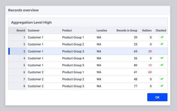
For demand forecasting, you need to go through a whole lot of records. We use the status bar to show you which data set and configuration you’ve got loaded, which record you're looking at and how many records, of the total, are approved. The status bar is clickable. So, if you click the current configuration message, you get a list of the available configurations. Same for the dataset.


Are there other improvements that you’d like to mention?
It’s now easier to hide the big drop-down menu in applications. We made some applications so easy and natural for the user to go through, that we don’t even need the navigation menu. We can just hide it. The UI is that seamless and simple.
What are you most proud of in this collaboration?
I’m very proud that we’ve been on such a long journey with AIMMS. It was not a quick, “here’s some design advice" and go. We’ve been on a journey together and we keep seeing value in the work that we both do. If I look now at how the apps looked three years ago compared to today, I think the UX and UI have greatly improved. The products are constantly evolving, which is inspiring to see.
For an overview of what’s new in SC Navigator, check out the release notes.


