Solved

Layout question

  • 25 September 2020
  • 6 replies
  • 191 views

Userlevel 5
Badge +7

Hi all,


Quite new to this WebUI thing in AIMMS, not so new to AIMMS itself (have done some things with AIMMS before….. :wink:). (Edit: after posting the question, I see the forum classifies me as an AIMMS newcomer …. :joy: )


I am starting to understand the whole concept with rows/columns in the layout, but not sure how to solve the following problem:

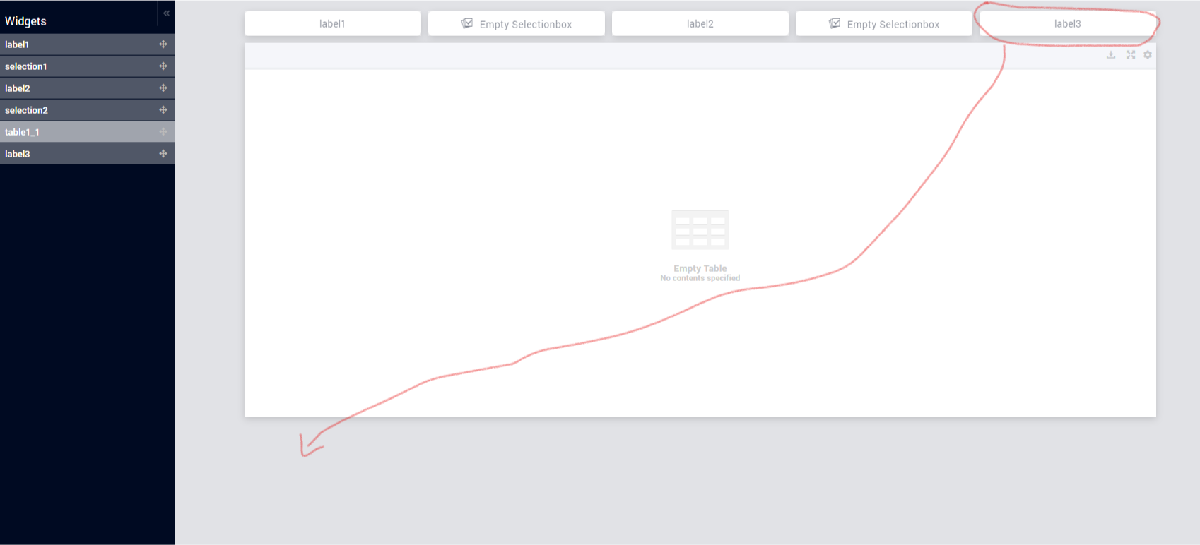
  • I have set the maximum number of columns on the page to 11
  • I have created two selection boxes (each 2 columns) and two labels to describe the selection box (also each 2 columns)
  • I then added a large table (10 columns)
  • Finally, I added another label of 2 columns, defined after the table

Because there are still 3 columns free after the combination of 4 widgets (2x selection and 2x label), AIMMS will place the final label not below the table, but still on the first row, behind the other widgets as you can see in the image below:


Is it possible to work with ‘spacer’ widgets to ensure a certain logical placement of the widget? How can I ensure in the webui that the last label should be placed below the table.


Is the only option to start using the custom position for all widgets? Or would this be solved by using the new experimental Grid Layout?

icon

Best answer by Gertjan 25 September 2020, 17:13

View original

6 replies

Userlevel 6
Badge +6

Hi @gdiepen

You can ditch the column and row thinking. Indeed, please check out the new Page Layout features we offered as experimental feature in 4.75: https://community.aimms.com/aimms-webui-44/grid-layout-for-beautiful-and-consistent-looking-applications-728. No custom position either anymore. 

Had a few calls with customers this week (early adopters) and they loved it and this new feature will help you with questions like you posted above. 


Some ideas: 

All doc on how to build this can be found at https://manual.aimms.com/webui/webui-app-development.html


Userlevel 5
Badge +7

Thanks Gertjan. For sure will take a look at the new page layout features now that I know how to enable the experimental features.

Even though you suggest to completely move to the grid layout, would still be interested to know whether it is possible at all with the column / row thinking :)


One solution I could think of is creating a NOOP plugin myself with the only task being blocking screen-estate, just wondering if anybody else ran into this before (with the current layout scheme) and found a solution for it.

Userlevel 6
Badge +6

We have seen customer place a label widget and make it completely transparent. You could also decide to do a label of 3 and a selection of 2 (times 2 =10); this fills it nicely on top. 

As the current layout has some of these quirks (due to an underlying tech called ‘packery’), we worked to this new layout and - as soon as we can - phase out the old style; uses GridCSS and no longer ‘packery’. Seeing what you want, that is easy to create (Wouldn’t want to sweat by trying to make it happen by above transparant suggestion and/or custom plugin - and then later converting).
 

Still love to reiterate 😁, placing these filters on the side panel allows you to just have the table on the screen. Then also, the new layout allows you to have the screen completely filled with the table (scale up and scale down) - no worries about max column setting. 
 

Love to see your solution once you have it.

Userlevel 5
Badge +7

Regarding the label of 3 and selection of 2, for me making widgets too large is not always the most aesthetic, so that is why I was thinking about this idea. Besides that, for me it is also always the matter of knowing: can it be done :)

With the winUI, I knew that I was able to create really everything I could think of because I knew the details and had become very creative in using some of the items in ways they might not have been intended, but did work :grin:

I just have to start over with the webUI and start learning what the different building blocks are and how I can use (and sometimes abuse) them in order to achieve my goal. One of the pitfalls might be that I will keep on comparing the webui to the winUI. e.g. I love the extreme flexibility that the winui pivot table has and I am missing some of the things like the outer area in pivot tables (to come back to your point, these filters would be within the same table then, or not, if you would drag them to the columns or rows). On the other hand, there might be some things easily possible in the webui that might have taken me quite some workarounds in the winui :wink:


Userlevel 6
Badge +6

PS: We added a data filter in the table in 4.75 as well (was not available in the WinUI); allows end users to filter header, columns, rows and do temp exploration. Especially handy if there is much more data available then the view port can handle. It’s a first version; but already very useful to show subselections. See 2nd item at https://documentation.aimms.com/release-notes.html#webui-improvements. Think you like it; and likely you have suggestions for improving it further.

Userlevel 5
Badge +7

Played around a bit with the CSS grid and indeed this looks really cool.

One potential improvement for the layout editor might be providing some information about errors: I was not able to save a layout because of an additional trailing comma after the last element in a list. Tried hitting the save button, nothing happened, also no feedback that something was wrong :)

Reply


Didn't find what you were looking for? Try searching on our documentation pages:

AIMMS Developer & PRO | AIMMS How-To | AIMMS SC Navigator