I'm requesting a secondary axis on the line chart. Here is why:
We have encountered a number of situations where we want to put two different types of data in one linechart. It is desired to combine the two types of data to see how they interact, but often they have a different scale or unit of measurement.
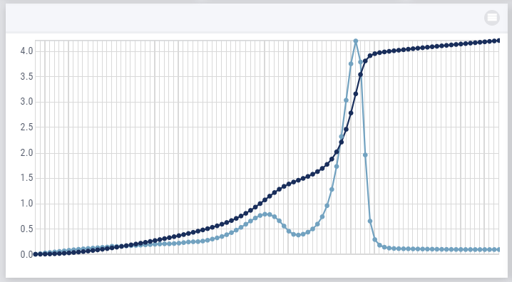
For example, the image below shows some value and is cumulative. If we show the true cumulative (which runs from 0 to 100), the light blue curve would look like a flat line close to 0.
As a work around we re-scale the cumulative value to create a nice picture, but now the y-axis makes no sense for the dark blue line. Although we can clarify much via tooltips, it’s not ideal.
Therefore, having a secondary axis would be a great solution.